Статьи с тэгом :
Закрыть
История изменений
Закрыть
Попробовать в облаке

Changing interface themes in ONLYOFFICE Docs

ONLYOFFICE Docs v8.1 История изменений ONLYOFFICE Docs

Version 8.1.1

Release date: 07/15/2024

Version 8.1.0

Release date: 06/19/2024

Version 8.0.1

Release date: 02/26/2024

Version 8.0.0

Release date: 01/30/2024

Version 7.5.1

Release date: 11/08/2023

Version 7.5.0

Release date: 10/17/2023

Version 7.4.1

Release date: 07/31/2023

Version 7.4.0

Release date: 06/13/2023

Version 7.3.3

Release date: 03/15/2023

Version 7.3.2

Release date: 02/14/2023

Version 7.3.0

Release date: 01/31/2023

Version 7.2.2

Release date: 12/20/2022

Version 7.2.1

Release date: 10/21/2022

Version 7.2.0

Release date: 09/22/2022

Version 7.1.1

Release date: 06/02/2022

Version 7.1.0

Release date: 05/12/2022

Version 7.0.1

Release date: 02/22/2022

Version 7.0.0

Release date: 01/18/2022

Version 6.4.2

Release date: 10/14/2021

Version 6.4.1

Release date: 09/28/2021

Version 6.4.0

Release date: 08/26/2021

Version 6.3.2

Release date: 08/10/2021

Version 6.3.1

Release date: 06/08/2021

Version 6.3.0

Release date: 05/20/2021

Version 6.2.2

Release date: 04/19/2021

Version 6.2.1

Release date: 03/31/2021

Version 6.2.0

Release date: 03/01/2021

Version 6.1.1

Release date: 01/28/2021

Version 6.1.0

Release date: 12/02/2020

Version 6.0.2

Release date: 11/12/2020

Version 6.0.1

Release date: 10/28/2020

Version 6.0.0

Release date: 10/14/2020

Version 5.6.5

Release date: 09/21/2020

Version 5.6.4

Release date: 09/08/2020

Version 5.6.3

Release date: 08/17/2020

Version 5.6.2

Release date: 08/07/2020

Version 5.6.1

Release date: 08/05/2020

Version 5.6.0

Release date: 07/29/2020

Version 5.5.3

Release date: 05/22/2020

Version 5.5.1

Release date: 04/09/2020

Version 5.5.0

Release date: 03/05/2020

Version 5.4.2

Release date: 11/27/2019

Version 5.4.1

Release date: 10/02/2019

Version 5.4.0

Release date: 09/03/2019

Version 5.3.4

Release date: 07/16/2019

Version 5.3.2

Release date: 06/24/2019

Version 5.3.1

Release date: 06/06/2019

Version 5.3.0

Release date: 05/28/2019

Version 5.2.8

Release date: 02/05/2019

Version 5.2.7

Release date: 01/16/2019

Version 5.2.6

Release date: 12/25/2018

Version 5.2.4

Release date: 12/12/2018

Version 5.2.3

Release date: 10/31/2018

Version 5.2.2

Release date: 10/05/2018

Version 5.2.0

Release date: 09/28/2018

Version 5.1.5

Release date: 07/18/2018

Version 5.1.4

Release date: 05/24/2018

Version 5.1.3

Release date: 04/27/2018

Version 5.1.2

Release date: 04/11/2018

Version 5.1.1

Release date: 04/05/2018

Version 5.1.0

Release date: 03/28/2018

Version 5.0.7

Release date: 01/16/2018

Version 5.0.6

Release date: 12/11/2017

Version 5.0.5

Release date: 11/28/2017

Version 5.0.4

Release date: 11/14/2017

Version 5.0.3

Release date: 11/02/2017

Version 5.0.2 только SaaS-версия

Release date: 10/13/2017

Version 5.0.1 только SaaS-версия

Release date: 10/05/2017

Version 5.0.0 только SaaS-версия

Release date: 09/23/2017

Version 4.4.4

Release date: 09/13/2017

Windows-only release

See changelog on GitHub

Version 4.4.3

Release date: 08/14/2017

Version 4.4.2

Release date: 07/24/2017

Version 4.4.1

Release date: 07/05/2017

Version 4.3.6

Release date: 06/14/2017

Version 4.3.5

Release date: 06/05/2017

Version 4.3.4

Release date: 05/16/2017

Version 4.3.3

Release date: 04/28/2017

Version 4.3.2

Release date: 04/17/2017

Version 4.3.1

Release date: 04/06/2017

Version 4.3.0

Release date: 04/03/2017

Version 4.2.11

Release date: 03/13/2017

Version 4.2.10

Release date: 02/20/2017

Version 4.2.9

Release date: 02/14/2017

Version 4.2.8

Release date: 02/06/2017

Version 4.2.7

Release date: 02/01/2017

Version 4.2.5

Release date: 01/16/2017

Version 4.2.4

Release date: 01/09/2017

Version 4.2.3

Release date: 12/23/2016

Version 4.2.2

Release date: 12/21/2016

Version 4.2.1

Release date: 12/06/2016

Version 4.2.0

Release date: 12/01/2016

Version 4.1.8

Release date: 11/03/2016

Version 4.1.7

Release date: 11/01/2016

Version 4.1.6

Release date: 10/26/2016

Version 4.1.5

Release date: 10/13/2016

Version 4.1.4

Release date: 10/07/2016

Version 4.1.3

Release date: 09/28/2016

Version 4.1.2

Release date: 09/22/2016

Version 4.0.3

Release date: 08/04/2016

Version 4.0.2

Release date: 08/03/2016

Apart from the available light, classic light, and dark interface themes, ONLYOFFICE editors can now be customized with your own color theme. Please follow the steps of this guide to learn how to do it.

The ability to add custom interface themes is available starting from ONLYOFFICE Docs v7.0.
  1. Create the .json file that will look like this:
    {
        "name": "Amazing theme",
        "l10n": {
            "fr": "Thème incroyable",
            "de": "Geweldig thema"
          },
        "id" : "theme-amazing",
        "type" : "light",
        "colors" : {
            "toolbar-header-document" :  "#446995",
            "toolbar-header-spreadsheet" : "#40865c",
            "toolbar-header-presentation" : "#aa5252",
            "border-color-shading" : "rgba(0, 0, 0, 0.15)"
            ...
        }
    }
                    

    where you need to specify the following parameters:

    • name: Defines the theme name which will be displayed in the theme picker of the advanced settings.
    • l10n: Defines the localized theme name. The object keys are the two letter language codes (ru, de, it, etc.) and the values are the theme name translation for each language.
    • id: Defines the theme unique identifier which has to begin with the theme- prefix. It may contain the a-Z, 1-9, -, _ signs.
    • type: Defines the theme type which can be dark or light.
    • colors: Defines the set of theme colors. Colors can be presented in the hex or RGBA formats. See colors for details on the color variables that this object can contain.
  2. Put the created file into the following directory:

    • Windows: %ProgramFiles%\ONLYOFFICE\DocumentServer\web-apps\apps\common\main\resources\themes
    • Linux: /var/www/onlyoffice/documentserver/web-apps/apps/common/main/resources/themes
    • Docker: Copy the file into the Docs container: sudo docker cp /home/username/folder_name/file_name {container_id}:/var/www/onlyoffice/documentserver/web-apps/apps/common/main/resources/themes
  3. The cache on the server for this request has a lifetime of 5 minutes, so the theme will be available 5 minutes later. You will need to refresh the editor page.

    In some cases, you might also need to restart services and clear the cache. For more details on how to clear the server cache, you can refer to the Troubleshooting section for Linux, or Docker.
  4. Now the theme will be displayed in the Interface theme list of the Advanced settings and you can apply it to the editor interface.

Colors

Header toolbar colors

Parameter Description Default

The toolbar header color for text documents.

toolbar-header-document

#446995

The toolbar header color for spreadsheets.

toolbar-header-spreadsheet

#40865c

The toolbar header color for presentations.

toolbar-header-presentation

#BE664F

The toolbar header color for pdfs.

toolbar-header-pdf

#AA5252

The text color of the user initials from the text documents toolbar header.

text-toolbar-header-on-background-document

#38567A

The text color of the user initials from the spreadsheets toolbar header.

text-toolbar-header-on-background-spreadsheet

#336B49

The text color of the user initials from the presentations toolbar header.

text-toolbar-header-on-background-presentation

#854535

The text color of the user initials from the pdfs toolbar header.

text-toolbar-header-on-background-pdf

#8D4444

Background colors

Parameter Description Default

The background color of windows, drop-down panels, regular controls.

background-normal

#fff

The background color of toolbar, all panels, dialog box header, panels with button in the canvas (headers of content controls, buttons for insert or autocorrect options).

background-toolbar

#f7f7f7

The additional toolbar background color. It is used for inactive sheets in spreadsheets.

background-toolbar-additional

#efefef

The background color of the primary dialog button.

background-primary-dialog-button

#444

The background color of the accent button in the text document editor.

background-accent-button

#446995

The background color of the tab underline for the gray toolbar.

background-tab-underline

#444

The background color of the notification popover (for example, about the review mode, filling forms, etc.).

background-notification-popover

#fcfed7

The background color of the icon notification badges from the toolbar header or the left-side panel.

background-notification-badge

#ffd112

The scrim color reducing the background intensity of the modal windows.

background-scrim

rgba(0, 0, 0, 0.2)

The loader background color.

background-loader

rgba(24, 24, 24, 0.9)

The background color of the button shortcut hints when the Alt key is pressed.

background-alt-key-hint

#FFD938

The background color of the information tips.

background-contrast-popover

#fff

The background color of the button from the form header.

background-fill-button

#FFD112

The background color of the information tip shadow.

shadow-contrast-popover

rgba(0, 0, 0, 0.3)

Highlight colors

Parameter Description Default

The highlight color of buttons, drop-down menu items, and other interactive lists on hover.

highlight-button-hover

#e0e0e0

The pressed button highlight color.

highlight-button-pressed

#cbcbcb

The pressed button highlight color on hover.

highlight-button-pressed-hover

#bababa

The highlight color of the primary dialog button on hover.

highlight-primary-dialog-button-hover

#1c1c1c

The highlight color of the accent button on hover.

highlight-accent-button-hover

#375478

The highlight color of the pressed accent button.

highlight-accent-button-pressed

#293f59

The highlight color of the header button on hover.

highlight-header-button-hover

rgba(255, 255, 255, 0.15)

The highlight color of the pressed header button.

highlight-header-button-pressed

rgba(255, 255, 255, 0.25)

The highlight color of the active tab underline for the gray toolbar.

highlight-toolbar-tab-underline

#444

The highlight color of the selected text in the regular controls.

highlight-text-select

#3494fb

The highlight color of the form header button on hover.

highlight-fill-button-hover

#FFE165

The background color of the pressed button from the form header.

highlight-fill-button-pressed

#DFB500

Border colors

Parameter Description Default

The border color of the toolbar, panels, and modal windows.

border-toolbar

#cbcbcb

The border color of the top toolbar active panel.

border-toolbar-active-panel-top

#f7f7f7

The color of the borders that divide the toolbar and panel elements.

border-divider

#dfdfdf

The border color of the regular controls.

border-regular-control

#c0c0c0

The general border color for toolbar buttons placed together on hover.

border-toolbar-button-hover

#e0e0e0

The border color of the element from the preview control on hover (slide preview, toolbar styles).

border-preview-hover

#bababa

The border color of the pressed element from the preview control (slide preview, toolbar styles).

border-preview-select

#888

The border color of the focused regular control.

border-control-focus

#848484

The border color of the palette colors.

border-color-shading

rgba(0, 0, 0, 0.15)

The border color of the input boxes when entering an invalid value.

border-error

#f62211

The border color of the information tip.

border-contrast-popover

#fff

The border color of the focused pressed button.

border-button-pressed-focus

#848484

Text colors

Parameter Description Default

The text color by default.

text-normal

rgba(0, 0, 0, 0.8)

The text color of the active element (of the selected tab, pressed button, etc.).

text-normal-pressed

rgba(0, 0, 0, 0.8)

The secondary text color (notes, explanations, etc.).

text-secondary

rgba(0, 0, 0, 0.6)

The tertiary text color (placeholders).

text-tertiary

rgba(0, 0, 0, 0.4)

The text color of links and link buttons in the notification popovers.

text-link

#445799

The text color of links and link buttons in the notification popovers on hover.

text-link-hover

#445799

The text color of pressed links and link buttons in the notification popovers.

text-link-active

#445799

The text color of visited links and link buttons in the notification popovers.

text-link-visited

#445799

The text color on the inverted toolbar background.

text-inverse

#fff

The text color of the toolbar header.

text-toolbar-header

#fff

The text color for the contrast background (loader, cell titles in sheet view presets).

text-contrast-background

#fff

The text color of the button shortcut hints when the Alt key is pressed.

text-alt-key-hint

rgba(0, 0, 0, 0.8)

Icon colors

Parameter Description Default

The icon color.

icon-normal

#444

The icon color of the active elements (selected tab, pressed button, etc.).

icon-normal-pressed

#444

The inverted icon color (currently, it is not used in the interface).

#fff

The icon color from the toolbar header (for example, an icon with the user initials).

icon-toolbar-header

#fff

The icon color of the notification badges from the toolbar header or the left-side panel.

icon-notification-badge

#000

The icon color for the contrast information tips (currently, it is not used in the interface).

#fff

The color of resolved comment checkboxes or other success indications.

icon-success

#090

Canvas color

Parameter Description Default

The workspace background color behind the document page, sheet or slide, column heading background, and column grouping interface background in spreadsheets.
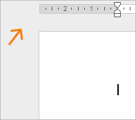
canvas-background

#eee

The background color of the document page, cells or slide.
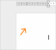
canvas-content-background

#fff

The border color of the document page.
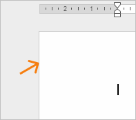
canvas-page-border

#ccc

The ruler background color.

canvas-ruler-background

#fff

The ruler border color.

canvas-ruler-border

#cbcbcb

The background color of the ruler margins.

canvas-ruler-margins-background

#d9d9d9

The color of the ruler marks (target and text).

canvas-ruler-mark

#555

The border color of the ruler handle.

canvas-ruler-handle-border

#555

The border color of the disabled ruler handle.

canvas-ruler-handle-border-disabled

#aaa

The color of high-contrast elements (tab marks on the ruler, grouped cell symbols).

canvas-high-contrast

#000

The color of disabled high-contrast elements (tab marks on the ruler, grouped cell symbols).

canvas-high-contrast-disabled

#666

The cell border color.

canvas-cell-border

rgba(0, 0, 0, 0.1)

The text color of the cell title.

canvas-cell-title-text

#444

The background color of the cell title.
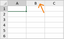
canvas-cell-title-background

#f7f7f7

The background color of the cell title on hover.
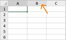
canvas-cell-title-background-hover

#dfdfdf

The background color of the selected cell title.
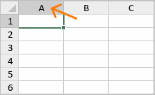
canvas-cell-title-background-selected

#cfcfcf

The border color of the cell title.

canvas-cell-title-border

#d8d8d8

The border color of the cell title on hover.
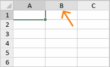
canvas-cell-title-border-hover

#c9c9c9

The border color of the selected cell title.
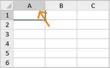
canvas-cell-title-border-selected

#bbb

The scroll thumb color.

canvas-scroll-thumb

#f1f1f1

The scroll thumb color on hover.

canvas-scroll-thumb-hover

#cfcfcf

The pressed scroll thumb color.

canvas-scroll-thumb-pressed

#adadad

The border color of the scroll thumb.

canvas-scroll-thumb-border

#cfcfcf

The border color of the scroll thumb on hover.

canvas-scroll-thumb-border-hover

#cfcfcf

The border color of the pressed scroll thumb.

canvas-scroll-thumb-border-pressed

#adadad

The scroll arrow color.

canvas-scroll-arrow

#adadad

The scroll arrow color on hover.

canvas-scroll-arrow-hover

#f1f1f1

The pressed scroll arrow color.

canvas-scroll-arrow-pressed

#f1f1f1

The target color of the scroll thumb.

canvas-scroll-thumb-target

#cfcfcf

The target color of the scroll thumb on hover.

canvas-scroll-thumb-target-hover

#f1f1f1

The target color of the pressed scroll thumb.

canvas-scroll-thumb-target-pressed

#f1f1f1

The cell background color in the Sheet View mode.
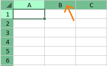
canvas-sheet-view-cell-background

#73bf91

The cell background color in the Sheet View mode on hover.
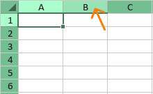
canvas-sheet-view-cell-background-hover

#97e3b6

The pressed cell background color in the Sheet View mode.
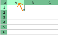
canvas-sheet-view-cell-background-pressed

#aaffcc

The cell text color in the Sheet View mode.
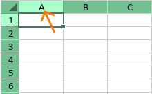
canvas-sheet-view-cell-title-label

#121212

The Select all cells icon color in the Sheet View mode.
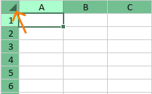
canvas-sheet-view-select-all-icon

#3d664e

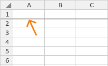
The freeze line color with shadow.

canvas-freeze-line-1px

#818181

The freeze line color without shadow.

canvas-freeze-line-2px

#aaaaaa

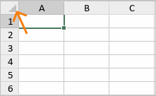
The Select all cells icon color.

canvas-select-all-icon

#82878f
Скачать Разместите на собственном сервере Доступно для
Docker, Windows и Linux
Вас также может заинтересовать:
Закрыть